Telematics Dashboard

Overview
The Company
Arity is a startup born from Allstate Insurance. Arity leverages data collected through mobile devices (telematics) with the goal of making transportation smarter, safer and more useful for everyone.
The Product
As a part of the Insurance Solutions suite Arity offers to insurance companies nationwide, my team was tasked with developing a digital reporting solution to aid new program managers in the launch of a telematics insurance program.
The Challenge
Design a dashboard to provide an overview and health check on a new telematics program for a telematics program manager.
The Process
Working in agile XP paired with another product designer in one week iterations with a co-located development and business team.
Research & Discovery
We interviewed internal stakeholders, spoke with new telematics program managers including VPs of large insurance companies, and interviewed the coordinators running the day-to-day efforts of implementation.
Our goal was to understand the day-to-day concerns of these users, to understand difficulties in setting up a new program, and learn how the right information might allow for implementable solutions.
Goals of the telematics manager include showing value of the program to stakeholders and taking measurable action in communicating to insurance agents and monitoring the process around the telematics program itself.

Through our research we found that our customers had four needs:
Insights & Direction
Help customers focus on the right data points and trends
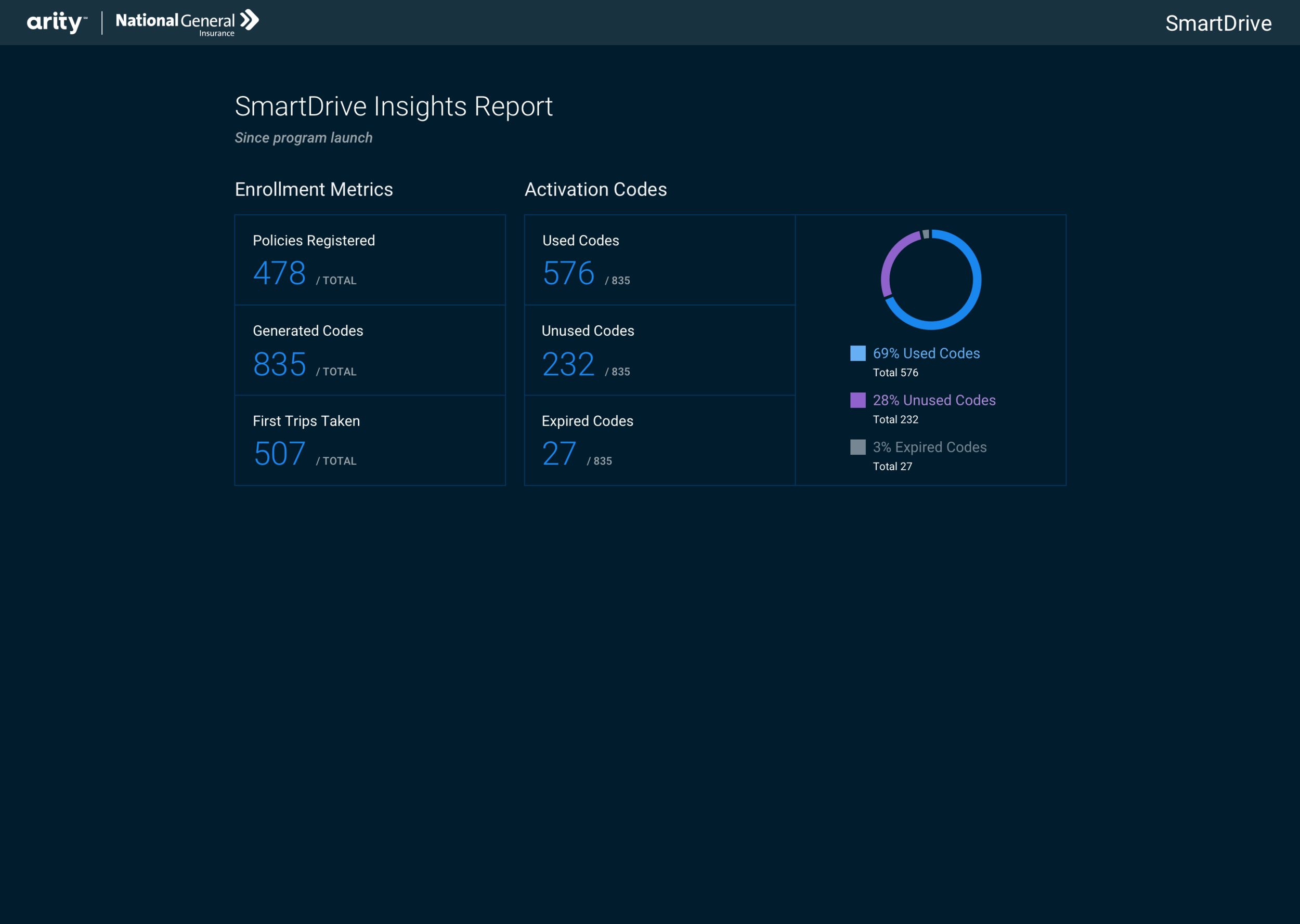
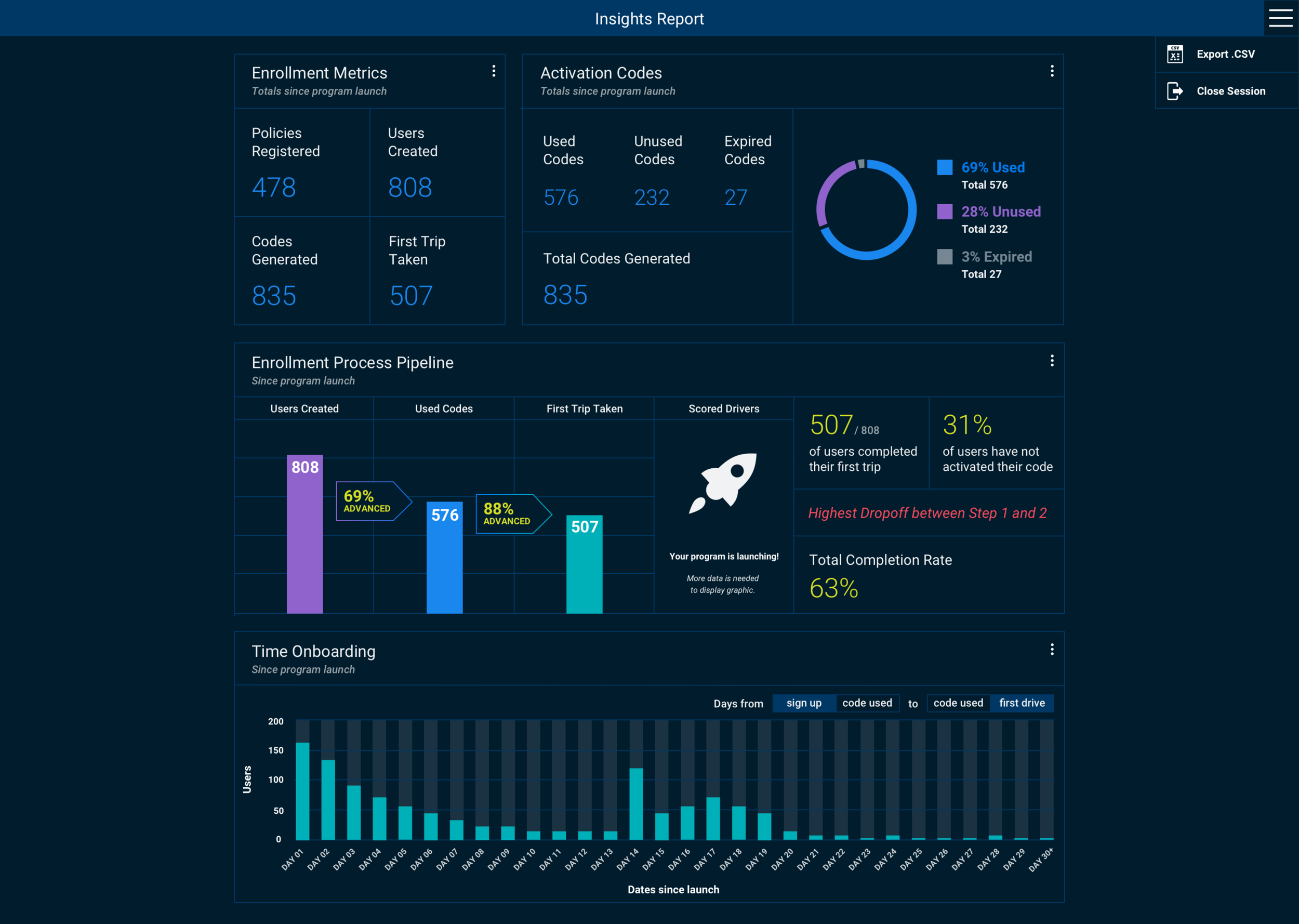
With so much data available through our API, our customers to focus their attention. Our solution would guide the customer through the massive amounts of data to critical conclusions in program execution. We pulled out high level metrics from the data that would normally take hours to parse, quickly focusing the telematics program manager's attention on what matters.
Help make sense of this data on the customers’ own terms
Data manipulation through familiar tools gives our user ownership of both the data from the program as well as any resulting insights. Our solution should allow the user access to the data and embrace the tools they have found success in. We allowed for this by allowing our user to download the data in excel and further explore beyond our high level overview.
Help determine what’s ‘normal’ for a new telematics program
Users have little to benchmark themselves against when starting a new program. Without a benchmark, they have no way of knowing if they are on the road to success or failure. Our solution should give the user a firm grasp of industry standards. Our research informed business practices and Arity customer engagement would provide weekly benchmarking to new telematics managers through online meetings.
Help to create trust with a 3rd party vendor through clean and transparent data
Our user believes that an external vendor won’t have the attention to detail necessary to provide accurate and useful reports. We that found users will take the time, sometimes lasting hours in a day, to match external reports against internal data. Our solution should facilitate trust in the company, the data, and the report. We would provide the data from our dashboard in .csv so telematics program managers could easily reconcile the report data with data from the API with their own.
Content Creation
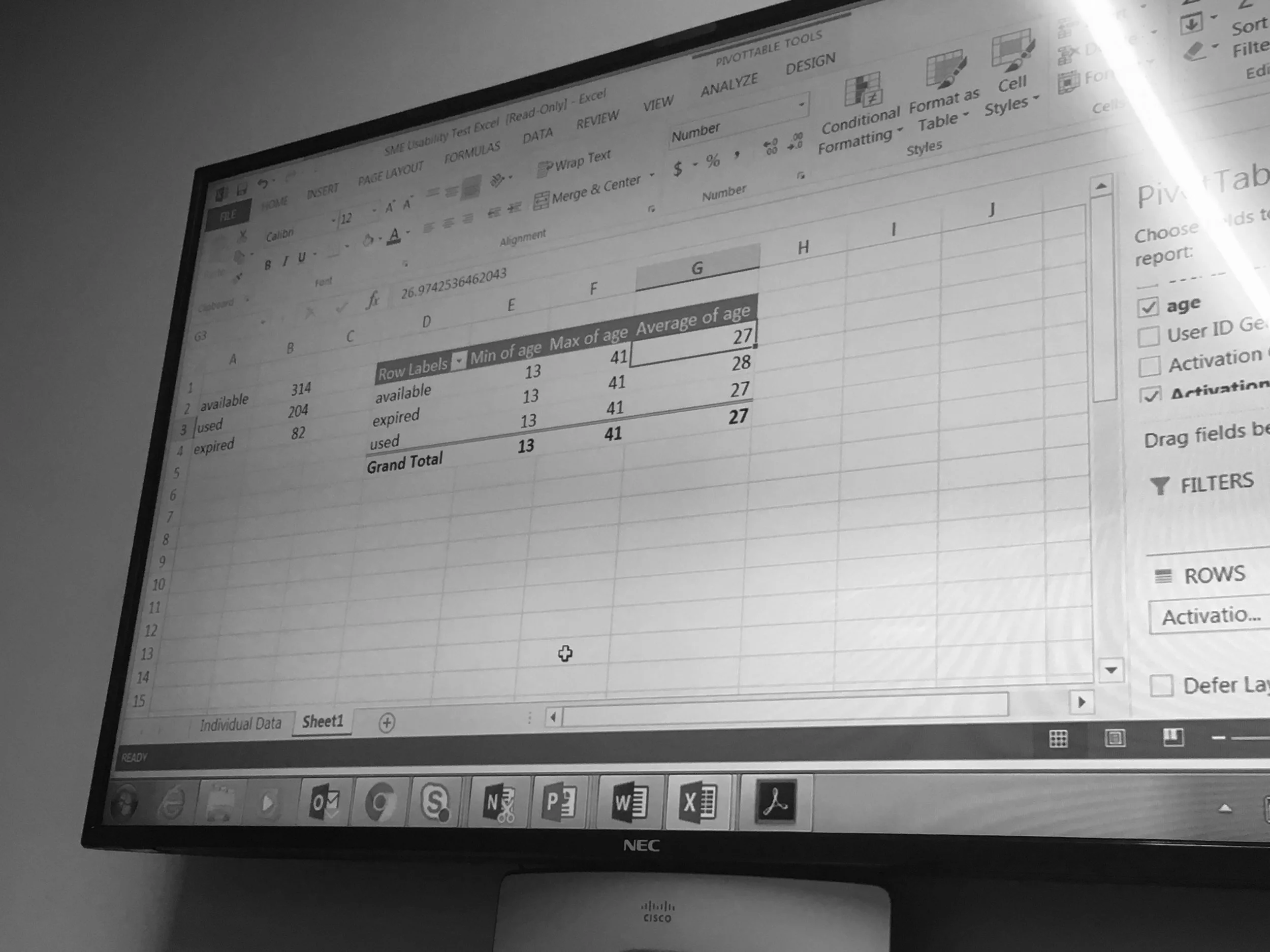
What data is available?
To understand what data we could present on a telematics dashboard we had to understand when we were collecting data and what that data meant. Working with a service blueprint, we were able to tease out vital moments in the telematics program (seen in blue).
How would our customers naturally make sense of our data?
We worked with our developers to create a sample set of data and handed it over to our subject matter experts, who were fluent in Excel. We asked them where they would look to check the health of a new telematics program, and what data would be of interest.
Our goal was to see what content they found interesting, what content they found useful, and what content they found actionable.
Visualize the Data
Dark vs Light UI
We tested the branded colors for AA and AAA accessibility to determine whether a dark or light UI would be more functional. With more colors in the dark UI passing standards, we determined a dark UI was the way to go.
Component Iteration
We explored different ways to visualize information and components we discovered through testing with our experts.
We began by sketching ideas, mocking these up medium and hi-fi sketches. Once we had the look and feel down, we iterated on how each component could be displayed.

Creating a Dashboard of Useful Components
The Agile XP Process meant that we worked with our development team to code the smallest releases each week. This translated into us developing out the dashboard component by component.
Each successive release was an iteration on our MVP.


Next Steps
Test and iterate on dashboard with first clients.
Determine how users are using the excel file in conjunction with dashboard.
Build out dashboard interactivity and ability to play with data.